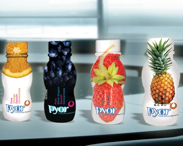
PYOR
A packaged offering of fresh fruit juices, the proposed brand was all set to launch in an already cluttered and saturated market of United States of America. With the key proposition of communicating ‘Purity’ of the ingredients, Pineapple named the brand as ‘Pyor’. It sounds phonetically same as ‘Pure’ and thus evokes the desired response of believability in the brand promise.
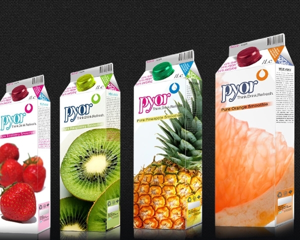
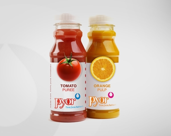
Consumer insights then led us to understand the decision making process- from feeling the thirst to choosing if it is water or a tasteful beverage and if it is a juice, then what is the flavour. Basis this packaging design is non-verbal yet clear & clutter-free, emphasizing on the fruit visuals. The over all impact is impressive- the premise of purity is depicted throughout from the name to the carton on the shelf.

